Sunday, December 28, 2008

My, my, how can you resist me?

The festive tv schedule was distinctly lacking this year, and so I failed to meet my usual quota of awful family-friendly movies. I did however manage to see Mamma Mia! on DVD though. Whilst I watched it I drew this.


I bought myself a new MacBook Pro for Christmas, and loaded it up with all the latest Creative Suite stuff too. Clearly it doesn't mean anything I do is going to be better, but it can at least now all be done from one armchair - as this picture was - using the built in iSight camera to take rubbishy photos of pages held up in front of it.

Monday, December 15, 2008

Coffee and TV


Not sure what this plastic milk bottle was doing on our coffee table as we watched The Pixar Story yesterday: we buy our milk in those plastic bladders. That's how green a household we are. In fact, we're so green we haven't even got the proper plastic refillable jug you get, that you pour your bladder-milk into again and again. We have to put ours in the one jug we have got: a big heavy glass thing that we're renting with the house. It doesn't fit in the fridge, so the milk doesn't last long and invariably ends up stinking on the counter for a couple of days before being poured down the sink, but still... that's a price we're prepared to pay for the sake of the environment. Nice, aren't we?

Thursday, December 11, 2008

More Gash type

As a treat, the Gash crowd let me have carte blanche (not literally, I still had to draw round the gash logo) on type design for this latest flyer.

Wednesday, December 03, 2008

IA: it's physical


I received a couple of the first copies of Love Letters in the post the other day, it's all very exciting. It looks really, really nice (and by nice I mean pink). All the colours and little details have come out perfectly. I'm pleased too with the thickness of it: the hard-back binding and 64 pages make it a veritable tome... definitely something that seems worth £4.99 anyway.

I'm sick of waiting for it to come out now. There's an impatient part of me that wishes it was battling away in the pre-Christmas promotional melee, but it would be near impossible for a nobody like me to take on books of the likes of Ross and Brand (I knew I should have done A is for Andrew-Sachs'-granddaughter), let alone Paul O'Grady, and plus the Valentines' market is undeniably more relevant.

Behind the scenes, all is apparently going well. A couple of major retailers have taken the book "on promotion", though I'm not entirely sure what that means, and there's an American publisher taking on a co-edition, though I don't know what that means either... I think basically someone changes all the s's into zs and then they sell it stateside.

Otherwise I'm working on building the website, lovelettersthebook.com, at the moment, which is taking longer than I expected but should be quite fun. And the book is up on Amazon too. You know that link on Amazon pages which says "I am the author...."? I can click that now. (I haven't yet, but I can).

Tuesday, November 18, 2008

Through The Wire, to the limit

Unlike the Ting Tings, I've started many things: a daily exercise routine, writing a proper novel, reading a proper novel, learning how to knit... but I've finished very few. So it was with a certain sense of pride I watched the final episode of The Wire last night. Still distinctly behind the bandwagon, but nonetheless: 63 hours of watching is something of an achievement.

And whilst everyone likes Omar (arguably that's what won Obama the US election) I've always had a soft spot for ol' Captain Do-rag Bodie Broadus, as demonstrated by this awful bit of teenage fan-art I made a week or so ago.
He was good people.


Great, wonderful, amazing show. Awful, awful title music.
Sing it with me now: "When you walk through the garden..."

Wednesday, November 12, 2008

Thank Christ: sketches from the inside of a coach

A bit too much drawings of girlfriends and not enough drawings of headrests stuff over the last two posts.

Monday, November 10, 2008

They're just so inventive

The agonies and ecstasies of Strictly Come Dancing, and underground scrawls from Thursday.


We never miss an episode of Strictly. Or at least, Char doesn't. Whenever I lift my eyes from my sketchbook/laptop/innovations catalogue whilst it's on it's always to look at her face twisting like a Spitting Image puppet in precise accordance the the BBC producers designs. It's the full gamut of human emotions: unbridled joy at the poetry of a tight celebrity fox-trot, unbearable anguish when a mean-spirited three is awarded. But then I guess my face is almost as varied as I go from mocking sneer to desperate fear when the programme ends and Char bounces up and insists we pace around the room together to imaginary music.

Wednesday, November 05, 2008

We're just like Mitchell and Webb, we are


Here's Charlotte cooking and criticising her computer, her two main interests. When she cooks she gives a running commentary suffused with passion because, she always tells me, I have no interest in food and because she knows it all: she has read all the books and never missed an episode of Jamie at Home. When she criticises her computer she is really critisicing me because when she bought it I was sent to PC World to collect it and somehow I got the wrong one (so fair enough really). And when it doesn't work all I can tell her is how you'd fix it if it was an Apple Mac (take it to the Genius Bar), which must be pretty annoying.
This sketchbook page is from the day before yesterday, 3 November, which is our three-year anniversary. After all this time I still can't really get a good likeness. This could be because it's impossible to get a good likeness of someone you love, but I wouldn't know. I've never been in love before -never really had a girlfriend before- so it could just be because I'm shit at drawing.
But all this seems silly now: cooking and computers and courting... Obama won! And by a long way, too. Yes we can, yes, we did etc.

Tuesday, October 28, 2008

This morning's commute, in sketchbook form.

I've used coffee to colour it in in a vain bid to be more like an artist.
I haven't had much chance to do my own creative stuff really, hence the fallow blog. Lots of graphic design type stuff, but that doesn't belong here. It belongs at jackkerns.blogspot.com.*


*doesn't exist.

Tuesday, October 21, 2008

Blogged


CMYKern is a young buck of a design blog which doesn't take itself too seriously. This is demonstrated by their featuring me this morning... Thank you CMYKern!

Thursday, October 16, 2008

Can't Be Arsed


Despite being but a few sleeps away from my 24th birthday, despite being so grown-up that top of my wishlist for my said birthday is a radiator bleed key, and despite, many birthdays back, Alanis Morrisette's best efforts to educate me, I still don't really know what irony means. This itself is ironic because I use it in speech all the time.

Now I've done a book cover- for a real book you can buy in Borders and on Amazon and in fact in loads of places, even Debenhams (it's true). It's the highlight of my illustratorial career and it was published just over a month ago. And yet I haven't yet been bothered to put it up on my blog. This is ironic, I think, because the book is called Can't Be Arsed. You see?

The book is by Richard Wilson, a big comedy cheese at Hat Trick productions (Have I Got News For You, Buzzcocks etc.) It's a genuinely funny anti-101 things to do before you die book, that is, it's a 101 things not to do before you die book. I had the good fortune of meeting Mr Wilson a week or so ago and by this point Can't Be Arsed had been out a fortnight and had already completely sold it's first print run, which people in the publishing world (technically that now includes me) say is an impressive feat.

Whether this initial success is a result of Mr Wilson's serious media connections garnering cover quotes from Paul Merton, Sean Lock and Boris Johnson and media coverage from The Times, thelondonpaper, Radio 4 and The Sun or in fact more to do with my name being there in 9-point text on page 4 is impossible to say. But either way, I'm proud.

Here's how the cover started. The art-direction was very specific: a man in an arm chair reading a book with his back to a load of the things you're not to do. For some reason I thought it was going to be in black and white.


Then I coloured it in and put in a funner bungee guy.


Brighter colours and some hand-type.


And some more type and colour variations.


In the end the publishers ditched the background elements from the front entirely, and used them as spots on the back instead. So the final cover actually looks a bit different to what I was expecting, but definitely stronger for that too.

Tuesday, September 30, 2008

Type and a table

I'm going to skirt seamlessly over the fact that over a month has passed since my last post. Why so? I could have been dead. I could have been on holiday again. In fact, I just haven't done much I can put up on here. (Although I came close to both when I went to muddy, trudgy, miserable Bestival.)

Here's one thing: another Gash! poster/flyer. A collaborative effort of sorts, with me doing the hand-type around the established logo. I did it all with a tablet, you know.


Also: I've moved house. The new place is really a collection of architectural flaws held together by little more than damp. But there is a big garden and there is a garage, we keep reassuring ourselves. And in the garage there were once two old doors, and now there is a fully functioning Table-Tennis set-up. So we are never bored.

If ever there was ever to be an image to sum-up the freelance lifestyle choice, this may be it:

Thursday, August 28, 2008

The other stuff what I did on my holidays

The second part of my European Summer odyssey was spent in Italy. I was back at Char's San Ginesio family home for the third year in a row. If you've seen the Bertolucci film Stealing Beauty you'll have a decent idea of the set-up. Imagine that, but with me in the Liv Tyler role.

We picked Ryan's Air.


Emily picked her legs.


San Ginesio has a population of 3,872.


I've drawn this all before.


If you're finding all this international doodlery overwhelming, I've now started putting all my sketches on a map.
It's an idea I've stolen from the "Seattle Sketcher" and, like Mr Sketcher, I'll be "geotagging" all my sketches as I do them.

View Larger Map

Tuesday, August 26, 2008

What I did on my holidays

I've been away for a while. And not just AFK, as they say in Second Life. Genuinely away: out of the country. Out of the office, even, meriting email autoreplies (if I had remembered to set it).

We (me, Char and five of Char's school friends: Henry, Hugh, Jess, Mark & Sophie) went to Saint Julien en Born, a little French hamlet (a jambon-let, you might say) somewhere between Biarritz and Bourdeaux.


There was a beach, Contis Plage I think it's called.


We were camping amidst a pine forest which was kind of idyllic when the sun was shining (which it was for about half the time). I was pretty much raised under canvas and so was ready for some of the vicissitudes of tent life and the others were fine with it too. Char on the other hand seemed to have completely misunderstood the object of the exercise. At one point early on becoming hysterical and bawling "We're living like tramps!".
It was what those in the camping game call a tents moment, probably.


There's nothing more tempting than a big red sign sticking out of the ocean saying "BAINE: COURANT VIOLENT".


It really was a great holiday.

Monday, July 07, 2008

IA: Update

I promised previously regular updates on my progress with the Inappropriate Alphabet, my book project due to be published sometime (hopefully) this year. And yet months on, this is the first such update... so if you've been hammering F5 or apple+R since then in the hope of developments, I'm sorry. There'll be more from now on.

The main struggle with turning what I had into an actual book has been the extra stuff, outside of the alphabet itself. I've drawn out end papers, dot-to-dots, quizzes and classifieds sections tried writing cast & character bios, contents pages, forewords and prefaces. And so far have had little success.

Otherwise though, it's largely been a case of colouring in all the originals. You may have seen already on my website the latest cover (with the sticker currently there awaiting a decent joke):


The title's Love Letters now, I guess that's pretty obvious. Here's the title-page spread:


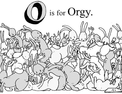
And then there's plenty of redrawing to do too. A lot of it is now done, but I've still got plenty to go. Sometimes it's just a case of adapting the original, as in with O is for Orgy, to fit the new spread-per-letter layout. Here's the O spread half way through colouring:


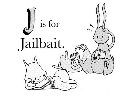
And then sometimes they're just not suitable, as in with J is for Jailbait. I tried replacing it with J is for Jennings Mask, but apparently that's even worse. I'm inclined to agree. I coloured this in and it actually made me feel a bit sick...

On Brixton


A digital sketch inspired by/completely ripping off this Russian guy. Photography and illustration combined, a bit like in Who Framed Roger Rabbit, is almost always cool.

Sunday, June 29, 2008

Gash for Cash*

Gash is a night at the Macbeth pub in Hoxton, most famous probably for being the scene of a kerfuffle involving Mr. Amy Winehouse, or something (though I guess she can handle herself well enough... all the drugs are turning her into John Prescott).
I was asked to help out with a flyer design, working with their established colour scheme and all-by-hand faux-amateur/amateur style. Something to do with young ladies sporting wounds, they said, or skulls. Or girls with skulls. Or skulls with wounds. Or ladies with their faces dripping off revealing their skulls...
I kind of like this first rough design (with all the wording to be later replaced by hand-type):

But not so much this one:

Nor this:

Or this:

They wanted something more like a good doodle, I was then told... so in twenty minutes did this one:

But in the end went with something like this:

I think I'm happy with it.


*Gash for Cash is entirely inappropriate of course: I wasn't paid. But it's amazing how many more hits come through Google with a post heading like that.

New website


Here it is. A new website... this time with a design section.
Plus... the latest Inappropriate Alphabet cover. It's called Love Letters now, I didn't tell you before did I?

Thursday, June 19, 2008

Guess What

It's always nice to be commissioned by a real person rather than a soulless mega-corporation. Real people spending their own real money, especially with this "credit crunch" on (sounds like a cheap breakfast cereal). Such was the case with this job: 48 portraits of real people for two bespoke editions of Guess Who? to be given as birthday gifts.


They took ages, but were well received apparently.

Note to any soulless mega-corporations reading: please do commission me.

Tuesday, June 17, 2008

This blog as a "wordle"


Personal type posters by robots... how long till there's an ad campaign based on these?
Make your own.

Wednesday, June 11, 2008

Pete Doherty: half man, half man

Here's a picture I did months ago for a Notes from the Underground short story. I was politely waiting for it to be published before posting it, but the paper is on ice whilst they try and secure arts council funding, or something... and I've got to put something up, right? It's been weeks.
The story is about Pete Doherty (once of the Libertines, now of the gossip columns) upon his death giving up his cadaver for Modern Art, and specifically for a Damien Hirst-style halving-and-pickling.
Here's the sketch:


And here's the final:

It's all came out a bit blue and insipid, but I kind of like it. The composition isn't really done as it's awaiting the text of the story to go between the halves, so it'll be interesting to see how it finally looks in the paper.
I'm currently rebuilding my portfolio website so that it can include in it some of my design work, and it looks this image may come in handy as the basis of the splash page. It's often said that Pete and I look alike (see right- he, on the left, deliriously happy on a cocktail of class As, me, right, quite content with a Scotch egg) so I can pass it off as a self-portrait. The division conveniently serves to represent the division within me as part designer, part illustrator (and part pretentious loser, as represented by the negative form in between).
Here's a sneak preview... yawn with your mouths closed please.